Friday, January 22, 2010

The Photoshoot, or Strike a Pose, Zanzibar Wine Table

As promised, here is the highly anticipated tour-de-force that is the second installment of my product photography adventures!

Okay, the subject matter itself might not be anything particularly earth-shattering, but I found the process pretty fascinating and entertaining myself. As I explained before, instead of hiring a product photographer at an obscene rate to turn in pre-edited photos dropped out on white, we paid a portrait photographer his session rates (much, much cheaper) for photos shot on a white-paper background. Then, all I had to do was learn Photoshop to clip the product out myself. Yes, I had to learn Photoshop at age 24. I'm officially the worst computer nerd ever.

In the last post, I showed you the finished product that we got from our photo sessions. This time, I'm going to show you how we got those photos. For smaller product, we used a light-softening white nylon tent, pictured below:


By placing a stand underneath the tent, we could raise the product enough to give the product a white base. We shined a bright true-white spotlight from behind and into the tent, illuminating the back without shadowing the front of the product. We also used warmer (reddish) flashbulb lights on both sides of the tent, casting a soft, shadow-free glow on the product. Unfortunately, our nylon tent was heavily wrinkled from months of improper storage, so even after considerable ironing, we had some refracted light and anomalies in our background. Nothing a little Photoshop can't fix, but it's still a bit annoying to look at in our raw photos:


Before I forget, I would also like to mention something about glass. Glass by itself is very hard to photograph with the lighting required to whiten the background. The glass absorbs the light from all angles and basically becomes transparent without a very low exposure.  To counteract this, you can place large black objects or sheets of paper on either side, just outside of the photograph itself. This will create black outlines like you see on the glass above. These colored glasses didn't need it so much, but clear glass just looks so much better with darker outlines. The opposite approach is to use a black background to make the glass stand-out with white outlines which tends to look more elegant. Because we're photographing for the web, and have a true white background, sadly, this wasn't an option.

All of those photographs of standing items that show the background will require heavy clipping to remove the phantom waves caused by wrinkles in the backdrop. Fortunately, for the smaller items that required a top-down shot, the tent still resulted in almost perfect photos without editing:


Our mounted racks and floor racks required additional space, so we unfurled an enormous sheet of white paper with about 8 feet of floor length, placed a foil sheet to reflect light up into the glass bottles, and positioned two spotlights aimed at the background behind the racks:


This gave us a true-white background and eliminated most of the shadows on the ground. However, we were unable to correct the warm light effect around the racks, giving us a slightly pink/tan gradient towards the bottom of the rack. I've been having to clip out the bottom half of almost every rack:


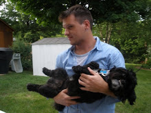
This picture also brings up an amusing point; since we couldn't mount the mounted racks in the studio, I had to hold up each one up while touching it as little as possible, then photoshop myself out of the picture. Good times...

All of this I've learned as it happened.  I'm having a lot of fun figuring out all these different lighting effects, exposures, and background options.  If you've got any tips for me to make my next shoot go easier, or for anyone in general, leave me a comment. I'm always looking for advice!

Josh

Listened during this post: Spotlight by Tom P, Himitsu by Tujiko Noriko, Ox-Eye by Jeniferever, Losing Out (Ft. Royce Da 59") by Black Milk, Let Me Go by Brittany Street, Brick Eyes by Garland of Hours, Polygraph Right Now by The Spill Canvas, Mare Mortis by The Appleseed Cast, Handshake Drugs by Wilco

Tuesday, January 19, 2010

Photoshop, or All I Need to Know about Website Design I Learned in My Mom's Basement

Now that we (finally) have obtained a sizable amount of raw photos to begin processing for the website, I thought I would share the process I am going through in order to make the many, many product photos that will populate the website, over 1200 in all. For the next few weeks, my life will be a very predictable blend of copywriting in Notepad and photo editing in Photoshop. It's an interesting combination of very high tech and very low tech (I'll leave you to figure out which is which), but they each serve their purpose perfectly.

The best piece of advice I can give you is (after the fact) a no-brainer: if you haven't upgraded to Photoshop CS4 yet, do it! It's so much more efficient and automated. I clipped photos at an average of about 15 minutes in CS3 and at an average of about 7 minutes in CS4. The magic wand tool itself is so much more intelligent in the newer version. It managed to eliminate more than 95% of my background in CS4 every time, no matter how far from white it was. I know it's yet another software investment on your end, for essentially an upgrade, but if you compare it to the man-hours you'll save over the long run, it really is cost-effective.

Oh, right, the process. I'm getting side-tracked...

First, we hired an outside photographer to take our photos. Rather than paying a product photographer an exorbitant amount of money to take our photos on a true white background and process them for us, we hired an hourly portrait photographer with a white sheet background to take raw photos and are processing them ourselves. Basically, we're paying less than 10% of the real cost to do more of the work ourselves; this is perfectly fine with me, as we have a month until launch, and I have no problem with putting on some headphones and clipping photos for a couple of weeks.

I'll be doing that with around 400 NEF (Nikon Electronic Format) files. When we first get them, they're about 9MB each, around 3000x6000 pixels, and come with handy pre-clipping features in Photoshop, including color recovery, exposure settings, and saturation effects. For example, I can take the brightest photo we had with no color loss:


Mess with a few settings, turn up the exposure, recover some color, crank up the vibrancy, and I get this without clipping a single pixel:


This background is sufficiently white enough that Photoshop can clip almost everything around the item via the magic wand tool without encroaching upon the photo itself.  From there on out, it's just clipping out the shadows using the pen tool (or softening them with the eraser tool, if you want to keep them) and making sure any hollow spots (like the white space inside of the handles) get clipped out as well. After squaring off the image, all that's left is resizing for large size (about 1000 pixels), viewing size (about 320 pixels) and thumbnail size (about 80 pixels). Here's the viewing size (the default picture on the product page):


I left the white spots inside of the handles alone for a reason: if you compare them to the background, you can easily tell that it's not true white. I want to stress that you remember to clip all parts inside the photo that are hollow, lest your customers notice the discrepancy and realize that you don't have the ability to hover your product in mid-air in a true white vacuum during a photo shoot. It sounds funny, I know, but you don't want to leave any signs of image modification. Once they consciously know that you've edited the photo's content, they may not trust that you haven't altered the actual product itself to make it a better sell.

That's all I have for now. My next post will detail how we set up the various items for different lighting colors, reflections in glass, under-lighting, etc., as well as clipping the hard way in Photoshop. Look for that later this week.

Got any Photoshop or photography experience? Any horror stories about poorly-clipped online shops? Share with us in the comments below.

Josh

Listened during this post: Slow Show by The National, John Allyn Smyth Sails by Okkervil River, Weddings by Broken Social Scene, What You Want by Japancakes, Strange Times by The Black Keys, Light Burns Clear by Sparta, Floor Rock by Ohmega Watts, Ambassador of Cinema by Maserati, Whoo! Alright-Yeah...Uh Huh by The Rapture, Walcott by Vampire Weekend, Over Under Sideways Down by The Yardbirds

Thursday, January 14, 2010

Haiti Relief Facts and Resources

I wanted to compile all the resources floating through the news and Twitter so that people wishing to help can best focus their efforts. Please add to my list via comments and by contacting me. I will update as necessary whenever possible.

Cautions
- If you want to contribute to a charity, either donate to a charity that already has a presence and a good reputation or carefully research to whom you're donating. If you're solicited for donations by an organization or find one that you haven't verified before, go online and find impartial verification that the organization is legitimate.  A lot of sick people are trying to profit from this tragedy.  This link has advice from the BBB about  finding trustworthy charities as well as links to directories you can trust: http://www.kval.com/news/81341017.html

- A lot of hoaxes are circulating based on rumors and wishful thinking on the part of people in the news in social media. Don't trust any information unless it comes from a VERIFIED source actively involved in the Haiti rescue and rebuilding efforts. Example: American Airlines is NOT soliciting medical professionals to fly for free to Haiti, but they are organizing an aid program http://www.cnn.com/2010/TRAVEL/01/14/haiti.airlines.aid/

- When in doubt, go with the Red Cross. Ideally, all the money is getting there regardless of who you donate to, so long as they're legitimate. We know the Red Cross is on top of this, so try one of their venues for aid if you're short on time.

Resources
- Anyone can text from their mobile to donate $10 to the Red Cross. From the article: "In the Red Cross' case, phone users can text the word "HAITI" to 90999 to donate $10," and when prompted, hit "YES" to confirm the donation." The $10 donation will be added to your cellular bill. Verizon and T-Mobile will not count the text message against your text total, and you will not be charged if you have no texts available. Note that texting is more reliable than visiting the Red Cross's website, as they maybe be over-trafficked.
http://www.msnbc.msn.com/id/34850532/ns/technology_and_science-wireless/

-Also, Yele, Wyclef Jean's foundation, is accepting text message donations. Also from the above story: "[send] a phone text-message [containing YELE] to 501501 to contribute" $5 to their Haitian relief efforts. You can donate up to six times per phone number through this method. Yele is not currently accepting donations through their website. 
Personal note: I chose to donate through Yele.

-Donate directly to the Red Cross via this website. Note, this is a donation to the entire Red Cross organization, not just to Haiti.
https://american.redcross.org/site/Donation2?idb=1204425599&df_id=4382&4382.donation=form1&JServSessionIdr004=vxk2t7yzf1.app195a

-The Haiti Emergency Relief Fund, organized by the East Bay Sanctuary Covenant, is a religion-affiliated human rights group that is accepting donations for relief efforts: http://www.haitiaction.net/About/HERF/HERF.html

- The Huffington Post has already compiled a phenomenal list that I will post an excerpt from and link. From The Huffington Post: "UNICEF requests donations for relief for children in Haiti via their Haiti Earthquake Fund [ http://www.unicefusa.org/haitiquake ]. You can also call 1-800-4UNICEF."
http://www.huffingtonpost.com/2010/01/12/haiti-earthquake-relief-h_n_421014.html

-From WRAL in Raleigh: "WRAL is teaming with the Red Cross to get your help to Haiti. The greatest need is money to help with rescue, recovery and rebuilding. All donations you designate for WRAL Disaster Relief will be used in Haiti." Go to this link to donate.
http://www.wral.com/news/national_world/national/page/6808988/

-Mashable's complete coverage can be found here: http://mashable.com/tag/haiti/


Thanks for your time and charity, everyone.

Josh

Tuesday, January 5, 2010

Numbering Systems, or What to Do When There's Nothing to Do

Unfortunately, as much as we've tried to avoid it, our site schedule is now at the mercy of our third-party developers: our graphic designer and our site coder.  We've got a lunch with the designer today, but until then, there's nothing left to do but write copy, write copy, and write copy.  It's a shame, because I was hoping to have a finalized site design to share with you all by now, but we might have to wait till next week on that.

What I had been working on up until now, aside from copywriting, is a numbering system for our product. Online shops have a distinct disadvantage to brick-and-mortar shops in that we have eliminated the hands-on shopping experience.  We can show pictures, technical specs, alternate views, even a 3D model if we're dedicated enough, but it will never replace a customer's ability to hold a product in his or her hand before making a purchase.  This still causes an issue for customers buying fitted items such as clothing and sensory-dependent items such as soaps and cologne. Another difference is that if a product has no label, a brick-and-mortar shop can always find a way to sell the product.  Online, some sort of labeling system is entirely necessary to making a sale.  Well, I suppose, if you really wanted to, you could have a website with an email address listed, a folder full of images, and a price list, and tell the customer to have at it, but that business model falls somewhere between asinine and woefully inefficient.  For any kind of automatic "shopping cart" system, product requires a numbering system.

Now, such a system can be engaged in several ways; one extreme is simply numbering from 1 to whatever, assigning items a number just for the sake of having a shorter reference point.  This is as effective as anything else as far as your computer system is concerned, and 90% of your customers won't even pay attention to it.  As long as you can keep track of it all, this system is quick and painless.

You can also just use the items' UPC codes.  This is probably the easiest system at first, but it tells you very little about the product.  UPCs are also redundant and cumbersome numbers, and some companies have been assigned duplicates (yes, it happens quite often).  It's also problematic if you're buying from artisans or hobbyists who are highly unlikely to even think about registering for UPCs.  If you're a very focused company who only buys from companies who are on the ball , so to speak, this system works, but it's very easy to hit a snag that way.

The next step would be a category system: you have categories, i.e. 10-5167, 10 being the category and 5167 being the item number, assigned in order from 0001 onward.  This is helpful because you can get a general idea of what the item is just by looking at the number.  In a store like Target, which uses a highly specific DPCI system (department, class, item), by looking at the first two numbers, an employee can tell a customer almost down to the aisle where the item is located even without knowing what it is simply from the first few digits of the code.

The most specific system is to have every number in an item code have a meaning.  A category would tell you what the general item is, i.e. food, clothing, toys, electronics. The next code would have yet another item, i.e. soft drinks, clogs, action figures, stereos.  Another code would have a brand assigned to it, i.e. Pepsi, Merrill, Mattel, Sony. From there, specific style codes would break down different models and colors, ensuring that a unique item code can be generated simply by looking at an item. Only a new style number would have to be looked up.  For the obsessive-compulsive or the micro-manager, this is basically a dream system.  It's also a complete and utter annoyance for anyone else and entirely unnecessary unless you have a smaller stock of items worth memorizing.

My system falls between the third and fourth examples.  I have my categories, 11 for standing wine racks, 12 for mounted wine racks, 13 for stemware racks, 21 for aerators, etc.  I also have a style system, an example of which follows:


Metallic
00 - Black
01 - Ebony
02 - Steel
03 - Gunmetal
04 - Copper
05 - Chrome
06 - Bronze
07 - Gold
08 - Pewter
09 - Silver

Wood
10 - Natural
11 - Spiced Pumpkin
12 - Java
13 - Mahogany
14 - Oak
15 - Maple
16 - Walnut


My system also uses a 3 digit item code, though the code itself won't have a specific meaning.  I'll know that if I have a Levered Corkscrew (Category 42), and the item number is in the teens, then I have a Metrokane, but 11 or 12 does not mean Metrokane in every category.  The item numbers are mostly arbitrary, though I tried to add some rhyme and reason within each category.  My system has to be modular, since we will be adding many items over the coming months, but I don't want an excessively long number to deal with while I'm populating the website.  The arbitrary three digit item code, then, is my bargain.

All together, I have a 7 digit number, laid out like this: ## ### ##.  Category, Item, Style. A few examples:

21 000 20: Aerator, Vinturi, Red.  A Vinturi Aerator for red wine.

45 020 00: Self-Pull Corkscrew, Corkpops Original, Black.  A black Corkpops Original Self-Pull Corkscrew

45 050 05: Self-Pull Corkscrew, Circa, Chrome.  A chrome Circa Self-Pull Corkscrew

Awful lot better than those huge SKUs Amazon and Best Buy use, although I would gladly bite the bullet and expand the system if it meant being able to move their volume of merchandise!

So what's on the agenda this week? I've got a photo shoot for all 400+ items, letting the wine racks and bottle stoppers strut their stuff, hopefully a website design meeting today, another design meeting later this week for the code side, and just writing and writing in the meantime.  It'd be nice if I had more to blog about, but I figure I should obey the quality over quantity rule lest I put my readership to sleep.  That would be most uncool of me.

Josh

Listened during this post: No One's Gonna Love You by Band of Horses, Esperance/Annamite by Garland of Hours, Vikings by Black Angels, Blindman - Cry for Help by Flying Lotus, The Pig War (O' Hunter Remix by Morgan of Blood Brothers) by Minus The Bear, At Last I Am Free by Pretty Lights, Leif Erikson by Interpol, She Came in Through the Bathroom Window by The Beatles, Asymmetrical Threats by Maserati